UX Case Study: Creating an Intuitive, Glanceable Wearable UI for Smartwatches
1
From Concept to Final Iteration: Creating a Pomodoro, Step, and Weather Display
The Problem

In a world of multitasking and constant movement, wearable users need quick access to essential information without being overwhelmed. The challenge here was to design an interface that provides Pomodoro timing, step count, time, and weather—all at a glance on a smartwatch display. Given the limited screen real estate, the design needed to be both visually intuitive and highly accessible, catering to users who want information quickly with minimal interaction.
The UX Solution

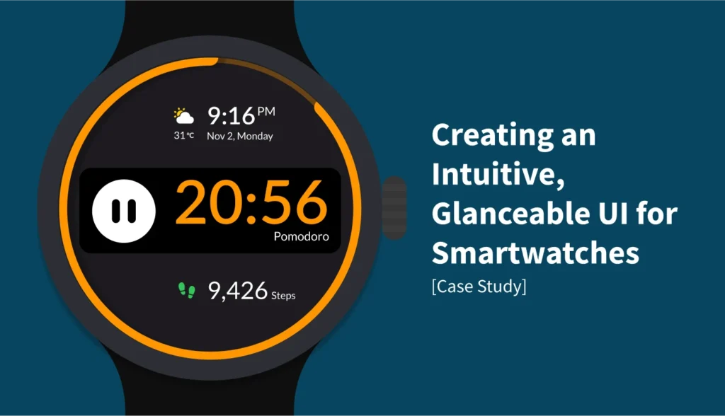
The solution was a quadrant-based design that divides the interface into four distinct areas, each housing a key feature. This approach provides easy access and clear separation of functionalities, allowing users to locate specific information quickly. As the iterations progressed, I introduced a circular progress indicator for the Pomodoro timer to offer a visual countdown. With each iteration, I refined the layout, colors, and emphasis based on Apple’s wearable UI guidelines to ensure maximum readability and usability.
Key Features
- Fig. 1: Quadrant Layout: The initial quadrant layout allowed for simple navigation between features, giving each section clear boundaries for user focus.
- Fig. 2: Circular Progress Timer: A visually engaging circular border that depletes as the Pomodoro timer counts down, offering an intuitive way to track time.
- Fig. 3: Balanced Hierarchy: The final design focuses on readability by emphasizing the primary feature (Pomodoro) while making secondary info (steps, time, weather) accessible but less prominent.
- Fig. 4: Visual Refinement: Color schemes and spacing were adjusted for optimal legibility under various lighting conditions, ensuring quick glances were sufficient for information retrieval.
Tools and Methods Used
This project was developed using Figma for design and prototyping. I relied on Apple’s Human Interface Guidelines for wearables to guide color choices, spacing, and readability. Each iteration was informed by usability best practices focused on creating a seamless user experience.
Potential Future Enhancements
- Customizable Features: Allowing users to select which metrics they want displayed in the quadrants, catering to individual preferences.
- Interactive Pomodoro: Adding functionality to pause, resume, or adjust the timer directly from the main interface without accessing additional screens.
- Dynamic Color Adjustments: Automatically adjusting the color scheme based on time of day or ambient light to further enhance readability in changing environments.
Reflections and Learnings
This project reinforced the importance of visual hierarchy and progressive refinement. Starting with a simple layout and building on feedback and guidelines led to a well-rounded final product that balances both form and function. I learned that wearable design requires a fine balance between minimalism and functionality, where every detail counts toward improving the user experience.
Connect to discuss UX projects

